Fund Screener
Client

Role
UX/UI Design
Year
2021 May - Sep
Create a screener experience that makes researching & analyzing funds less intimidating—helping customers understand their options and empowering them to make more informed decisions about their financial future.
The TIAA Fund Screener was designed around the concept of “High level to deep dive,” creating an experience that reveals insights layer by layer, intuitive at first glance yet rich in depth as users explore further.
The first step of the screener allows users to select a predefined filter provided by TIAA. Each selection uncovers funds aligned with a chosen investment theme, setting the stage for deeper exploration.
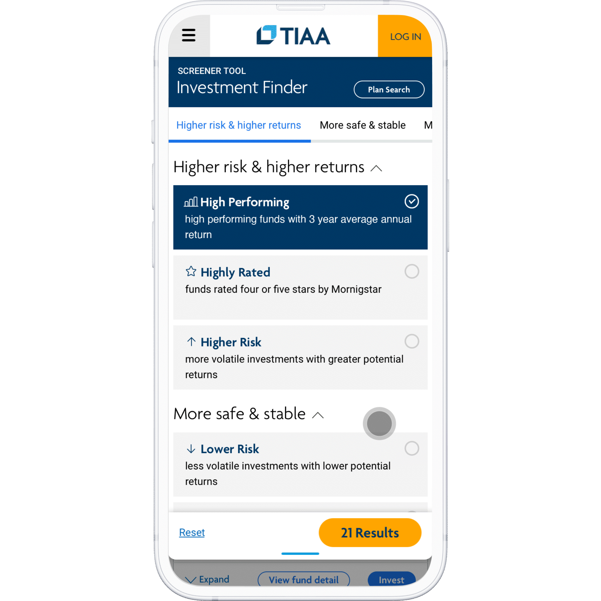
Designed to balance simplicity and control, users begin with quick filter selections that highlight TIAA’s annuities, then expand into detailed filters to refine results without feeling overwhelmed.
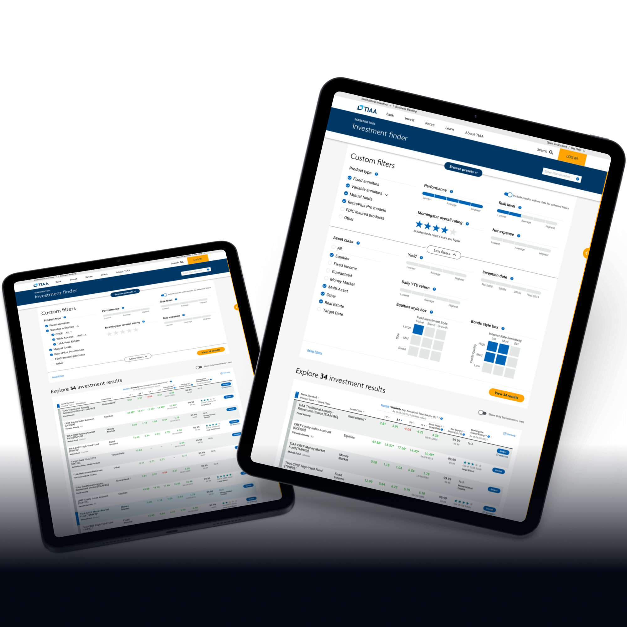
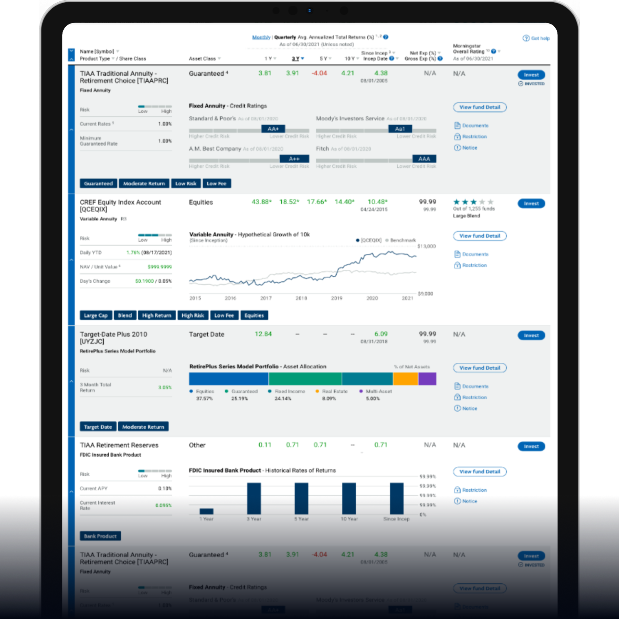
Each fund type emphasizes different metrics. The results table categorizes and visualizes these key data points uniquely per fund type, helping users uncover the most valuable insights at a glance.
A structured design process that began with defining integration goals and data priorities, then advanced through iterative design exploration, user testing, and final refinement to create a seamless, insight-driven fund screener experience.
Analyze Integration Points
After setting high-level project goals, we analyzed where the fund screener could be most effectively integrated within the existing TIAA platform. The focus was to enhance the user experience while delivering maximum value to investors.
Data Study
Conducted an in-depth analysis of all TIAA fund types to identify key data points and determine which visualizations would best represent each category. This ensured data relevance and clarity across all fund views.
Design Iteration & User Test
Explored multiple UI concepts and prepared three distinct versions of the screener design for testing. The TIAA user research team conducted user tests with these prototypes to validate usability, clarity, and engagement.
Final Design
Based on user feedback, we combined the strengths of the tested versions into a single optimized design. The final product integrated the most effective elements from earlier iterations, ensuring a clear and efficient fund screening experience.
The TIAA Fund Screener successfully addressed key usability and data visualization challenges that traditional fund screeners often overlooked. The new UI approach was highly recognized both internally and by the client for its innovative direction, enabling novice users to move intuitively from high-level insights to granular data points.
By introducing grouped data structures within the results table, we created a smoother, more efficient user flow. Additionally, unique data configurations for each fund type offered users meaningful comparative perspectives, making the screener not only functional but also an engaging and creative research experience.